Ok, so initially, Paint Tool Sai doesn’t work on Windows 10 for some people. So here’s how you fix that.
First of all, go to the folder where your program is installed. This is either in your C: drive in the “Program Files” folder, or, it’s running from a separate location, either way, you can use the Windows Search option with “Sai” to find it if you’re having difficulty.
Open the folder and right click on the Sai icon that’s marked “Application”. Not the green square one, the actual application with the Sai logo.
Click “Properties” and then “Compatibility”
And click “Run Compatibility Troubleshooter”.
Allow the program to detect problems. It shouldn’t take too long, so be patient!
Click “Try recommended settings”
This pop up will tell you what mode you will need to run it in, luckily, Windows will set it for you and allow you to test it. So click the test!
Cool! It works!
If everything is fine (and it should be); click to close the troubleshooter and allow it to run one final check. If not, click explore additional options to open Windows Help, or, go back to Properties as seen in images 3 and 4, and test the different compatibility modes manually.
You may need to back into the Properties box anyway to turn on the Compatibility Mode as this may not be checked, however, the compatibility you need should already be selected still.
You could also need to check “Run this program as administrator” too. Make sure you click “Apply” afterwards.
And that’s it! Enjoy drawing with Windows 10! Don’t forget you might need to set up your tablet settings again too and change your Maximum Canvas size in Others > Options > Workspace Usage
I should also say that this method would work with other programs too, including Manga Studio and Clip Studio Paint.
I hope this helped! Please reblog this to help others!
Neonlink~
For my art peeps
I’m not a digital artist but I know a lot of them. Here’s some help for anyone who needs it.
Next on the queue is some pointers on color. This may seem like the blind leading the blind, because it is, but I’ve put together a few tips that help me think about color.
ive always struggled a lot with describing what its like being colorblind on the red-green spectrum and giving tips on how to color as an artist (mostly bc i dont know what its like to NOT be colorblind) but this guy puts it extremely well! props to them for it
its helped me a bunch with my xenoblade props’ accuracy and i dont think many cosplayers know about it. its a really nifty program that converts an image into a poster, any size! you just tape the sheets together bam! perfectly scaled prop.
For those wondering about HOW to do this, here’s a short explanation according to me:
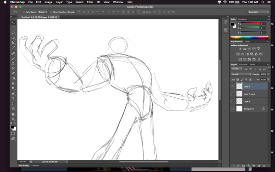
Drawing A to Drawing B: -the most obvious change is the exaggeration of the line of motion in the character.
In Drawing B the line of motion is much more pronounced, creating more drama and movement to the whole composition
-The arms are open wider, showing more confidence and exuberance in the character, exaggerating their emotions so they can be more clearly read without having to look to the face for emotional cues.
-the legs are wider apart, adding to the aforementioned confidence but also giving the character a solid foundation, visually speaking.
-The head is tilted back and overlapped by the chest, adding a touch of dynamic perspective to the drawing.
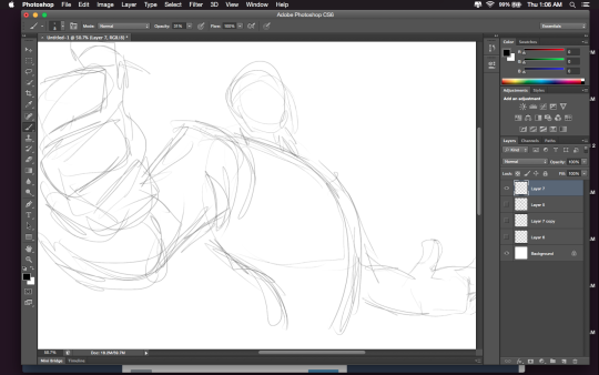
Drawing B to Drawing C: -Most obvious change is to zoom in on the character. Character framing is just as important as what the character is doing. Zooming in can help infensify emotions. this shot is ALL about this character and what they’re feeling. -Because of the zooming in, the arms/hands would have gotten lost, so instead of making the canvas wider, the artist has elected to rotate the character slightly, bringing a dynamic angle to things and more intensity to the close shot. -While the character is more upright in this shot compared to Drawing B, in Drawing C the chest still slightly overlaps the neck, preserving the feeling of being slightly below the character (putting them in a position of power relative to the viewer), which helps maintain confidence and power in the character. -the chest is exaggerated to carry the majority of the body’s line of action so even though you cannot see the legs, our brains are able to fill in the gap and envision that line of action. -The cropping/framing of the character allows for a more interesting composition/negative shapes created by the positive (character) on the negative (background), creating more visual interest as well as a circular motion to the composition through the arms, across the face to the negative space for the eyes to rest in before dropping to the hand in the background and back through the composition again.
Ok. I’m tired of the typical vampire, werewolf and fairy.I’m also tired of the occidental-centrism in mythology. Hence, this list.
I tried to included as many cultural variants as I could find and think of. (Unfortunately, I was restricted by language. Some Russian creatures looked very interesting but I don’t speak Russian…) Please, add creatures from your culture when reblogguing (if not already present). It took me a while to gather all those sites but I know it could be more expansive. I intend on periodically editing this list.
Of note: I did not include specific legendary creatures (Merlin, Pegasus, ect), gods/goddesses/deities and heroes.
(I have stumbled upon web sites that believed some of these mythical creatures exist today… Especially dragons, in fact. I just had to share the love and scepticism.)
This is perfect for my latest project ^~^
I need this to finish fleshing out my urban fantasy beyond Europe. Thanks!