A few peeps were wondering how I drew attacks in my nuzlocke comic, so I made a quick/kinda sloppy tutorial about it! Tbh it’s just me spamming luminosity and overlay layers haha ;yyy Hope this somewhat helps!
i got multiple questions about this, so i’ll just answer it on this ask
sorry i kept putting it off for so long…
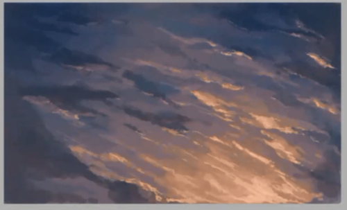
so… i guess i would think of what kind of sky i would want
i like sunsets, so i’ll draw that
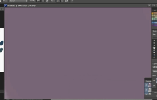
so i start with the very back color; it’s a dull purple
my intent is to go from purple/dark grey->peach/pink
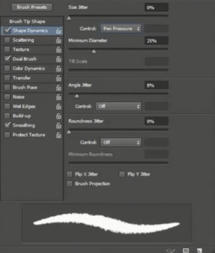
i like to use this fuzzy brush
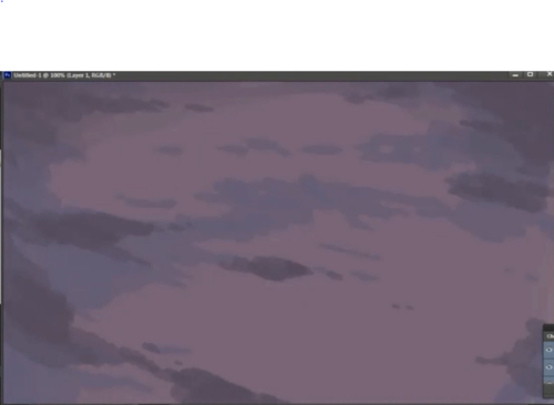
not sure what to call these… the ‘back’ / ‘dark’ clouds?
i put on random splotches at 40~50% opacity of dark blue around the edges
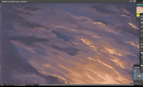
i’m going to put my light source at the bottom right, so i put a rusty orange color slightly at 10~20% opacity
then i blended the colors before i started to add more colors
the more you blend, the better the picture will look 8)
now i put my pen at around size 8-10 to put in thin areas of peach/gold where the light will hit at around 60% opacity
color it where ever you think it looks good
i like to adjust my colors and edit on sai
on an overlay layer on top of the drawing, i airbrushed so dark blue in at the top left and right
then near the end i like to use the combination of lower brightness and higher contrast
i’ll put a video later since my explanation is horrible most of the time…
sorry i put the drawing sideways… it wouldn’t fit
try these drawings for reference…
maybe use the eyedropper and use colors from these?
hope that helps
this is for the multiple color asks received
Use these techniques, but I highly suggest using them with photographic reference so you understand what you are painting. The best reference is real life.
It’s been a while but I’ve been working on some useful photoshop brushes for y’all and here they are! I hope you find them useful and please do let me know if any of them need tweaking! Enjoy! C :
Now, this gif always annoys me, because it shows up on my dash with comments like “omg this is the sexiest thing eva” and “men in suits hhhHHH” which is fair enough.
But this gif is a very poor example of a sexily suited man. His jacket is extremely ill fitted, as if it were made for a man four sizes up from him. His tie is crooked, too tight, and mis-lengthened. His shirt’s collar is the wrong size for him, and the way he buttons it makes it look as if he’s never done it before.
Here, ladies and gents, is how it is done.
This makes me extremely happy. God bless you correct suit man.
What always kills me is that he stands at parade rest at the end of gif two i’m just
It’s here! For those artists who spend loads of time trying to figure out why their art is not coming out the way they want it to be, making thumbnails (or making studies) is the thing for you! It’s also great of getting rid of the habit of zooming in.
not sure what to call these… the ‘back’ / ‘dark’ clouds?
i’m going to put my light source at the bottom right, so i put a rusty orange color slightly at 10~20% opacity
then i blended the colors before i started to add more colors
now i put my pen at around size 8-10 to put in thin areas of peach/gold where the light will hit at around 60% opacity